Wednesday, May 24, 2006
CARD DAY'S NIGHT
I am a card collector. Not Magic cards or stuff like that but I like to collect sets. I have all the Robert Crumb collector sets, for example, of Blues singers and Jazz performers and even his collection of Musette (French Sidewalk Musician) cards. I have the National Lampoon collection, a variety of oddball limited collections and all kinds of stuff.
This all started when I was a kid. I collected baseball cards. Which my mom dutifully tossed, year after year after year. So instead of being one of those guys on ebay asking 800 bucks for a Willie Mays card, I'm stuck with my memories.
But every year, I still buy at least one package of the current Topps cards, just to see what they look like.
They don't put bubble gum in there anymore. Too expensive, plus collectors were complaining that the cornstarch and oil in the bubble gum was wrecking the quality of the card it sat upon. Jeez.
But I always buy a pack, because if you're a designer for Topps, you have to come up with something new EVERY DAMN YEAR.
Not that you can't borrow elements from year's past. But here's what this year's cards look like:
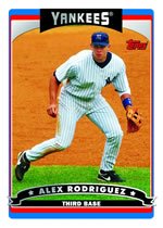
It's not really obvious from this picture, but these cards are SHINY. That's a SILVER team name and a SILVER player name, all on thick, glossy card stock. The colors are, for the most part, extremely bright and enhanced.
But the REAL design sense is on the back. I couldn't find a picture on the internet of the back of a Topps card, but these babies have color accents in a variety of possibilites: Purple, red, yellow, blue, green and a kind of red that Crayola used to call "Indian Red." (Apologies to you Native Americans but I don't know what they renamed it.) Each team gets its own accent color, which I suppose might make it easier to pull out entire teams if you grouped all your cards that way.
Plus, they've brought back the little cartoon drawings that have appeared periodically since the 50s -- you know the ones, with a factoid attached, usually but not always about the player on the front of the card.
My opinion of this year's design on a scale of 1-10:
Design: 6 for the front, 8 for the back.
Collictibility: 4. I don't think I'll be buying any more. The silver glare is a turn off for me.
Chances that this design will become buried in my brain like the 1960s Topps Cards that I collected with all my heart and soul, cards that I can STILL explain to you at the drop of a hat, like the fact that the 1969 cards had the player's name in a little colored circle on the front, and the team name blazing across the card bottom in big yellow letters: 0.
TT
Comments:
Post a Comment
![]()